


Robinhood Rebrands Ahead of Fintech’s Next Big Fight
How to brand so that your customers pay attention

Dear friends,
We are having a few turbulent weeks, with the trade war and the bloodbath in the stock market. It seems like nothing is going right. We are all anxious and check the news 20 times per day.
It is the right time to talk about why Robinhood rebranded to protect itself from market turbulence.
Why a rebrand?
and why you should care
Robinhood was launched 12 years ago. The company was a pioneer in making trading interfaces with gamification patterns and an intuitive layout. Its design was so immersive and psychologically rewarding, that Congress banned Robinhood’s famous confetti pattern to protect consumers from overtrading.

Robinhood redefined the category of consumer trading products. While other legacy brands focus on sophisticated analytics, Robinhood gambled with simplicity and user-friendly factors in trading products.
An unprecedented move that paid off. The company later IPO-ed at ~32 billion USD valuation.
In 2020, the company underwent its first major rebrand. The look was innovative, with the introduction of multi-color world-building. Their branding agency imagined an optimistic future with bright, spring colors.
However, as of 2024, the category matured. Robinhood faced fierce competition from Kraken, Chime, Coinbase, etc. All adapted similar branding strategies.
Robinhood’s stock fumbled. The market condition forced the company to stand out fast.
It needed a rebrand to draw consumers into its new offering in private banking and wealth management.
All great re-brands must start with a strategy
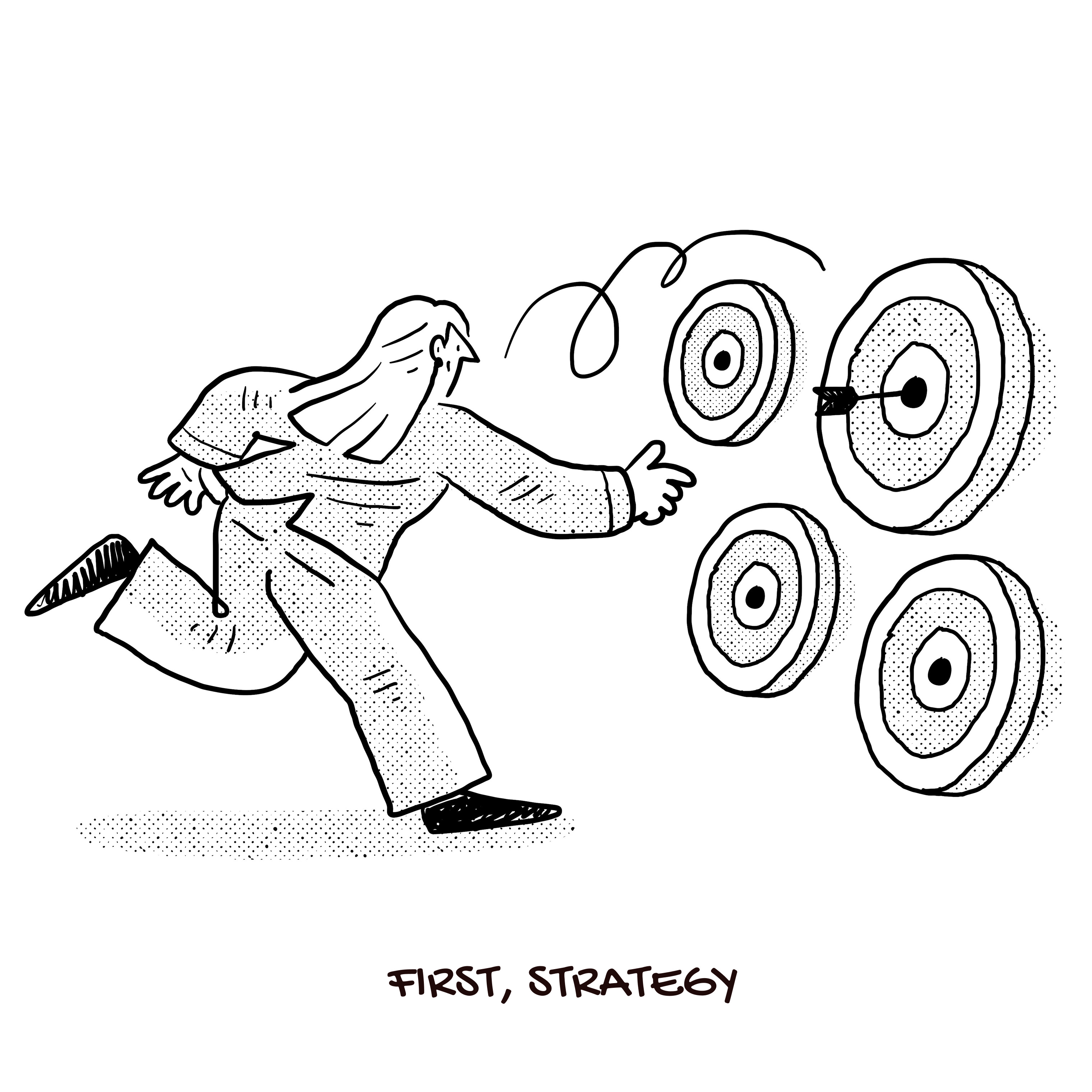
Many founders make this mistake when they pick an agency. They chose a team of great visual designers who did not understand strategy. This could be millions of dollars in mistakes. Or some companies messed up so much. For example: Tropicana lost $50 million in its rebranding attempt for misunderstanding customers. But that’s another story to tell.
🔥🔥🔥Some great branding strategies-for example:
Notion positioned itself as an “All-in-one workspace,” making it feel more flexible than Google Docs or Evernote.
Slack’s playful color palette makes it stand out in the corporate SaaS world.
Apple’s branding is clean, minimal, and feels premium—always.
Wiz chose to be optimistic in a sea of cyber security products that are fear-mongering and intimidating.
🤗 Questions to ask yourself:
What are your customers craving for now?
What are your competitors saying? How could you be different?
Why does rebranding work?
For many founders, branding sounds like astrology. You do not know whether it is the right money to spend and how to make it work.
But here are the metrics that a good branding strategy can bring.
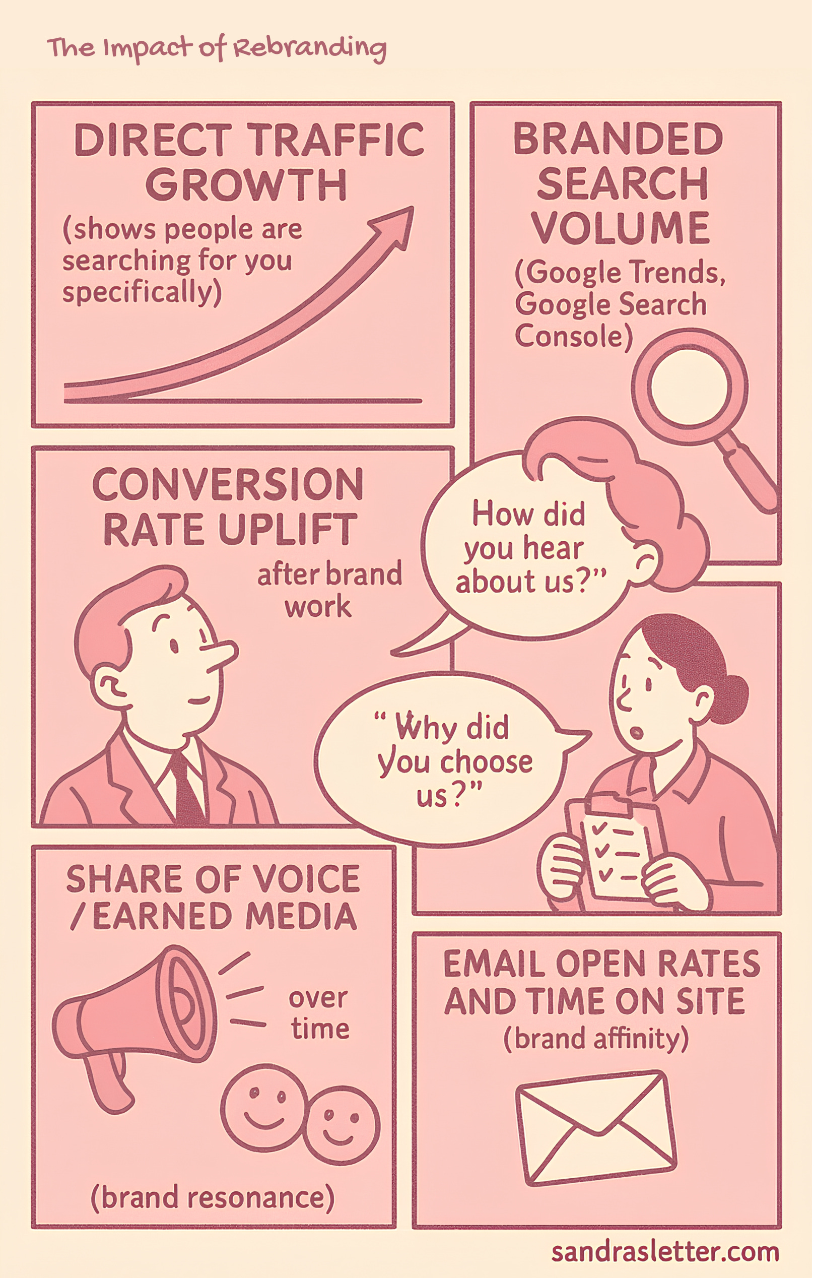
It is important to know that a great rebranding makes people talk about you and your offers.
By continuously introducing new themes, we rekindle the curiosity of our existing customers, drawing them in to explore our latest innovations.

Roy Katz, Head of Brand at Wiz
The designer’s proposal to Robinhood:
Robinhood decided to engage Porto Rocha. A rising design firm in New York that is known for blending strategy with art.
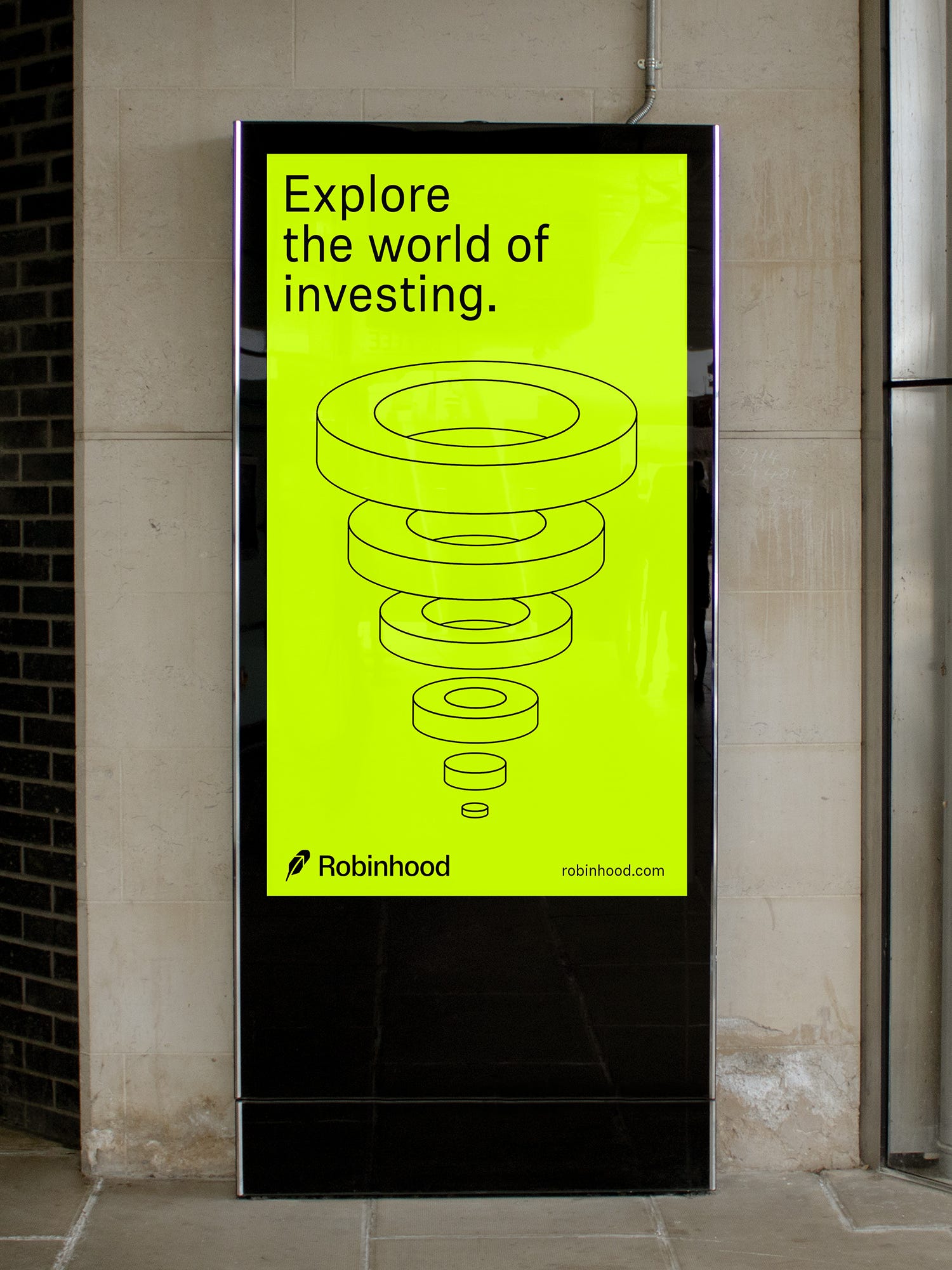
The design team decided–to stand out in a red ocean of fintech products: Less is more
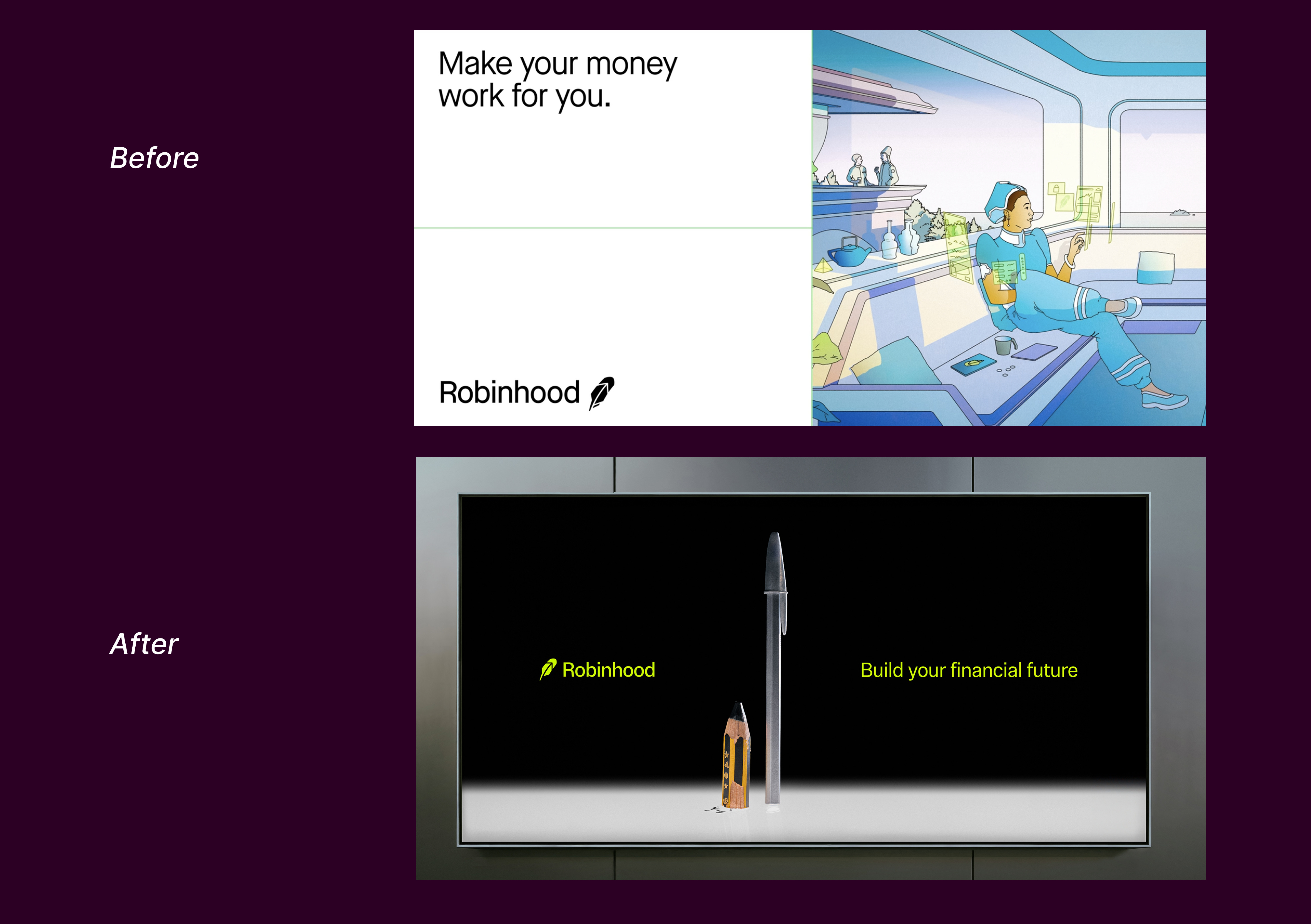
Porto Rocha stripped out all the colors and feathers of the previous branding iteration:
→ a more simplified logo symbol.
→ Say goodbye to the rainbow palette that competitors overuse. The new color is a focused combination of black, white, and mature neutrals.
→ adopt a fine art photography strategy
How Touch the Grass movement impacts Robinhood’s new strategy
The netizens now urge us to break free from screens. People went viral for building apps to curb our internet addiction and encourage us to touch more grass. If the last branding direction reflects that movement. The new visual direction of Robinhood captures a vivid sense of real-world objects.
The photography direction is dark, mysterious, and urban, with a respect for fine art photography. It is a rare direction in the world of branding photography. It is unheard of and unseen before.

It reminds me of Joe Gebbia, the co-founder of Airbnb– who studied extensively on the history of industrial design, said:
“Build something the internet has never seen before.” - Joe Gebbia, co-founder of Airbnb
🔨 Key Takeaway:
Is there any way you can reflect the internet culture in your branding?
What is the 5% difference you can push for from other competitors? What is the 15%, the 20% difference?
Why do tech companies like to go to New York for rebranding?

We notice a trend of tech companies like to work with New York branding agencies when they can:
Strong Understanding of Mass Market Appeal
Many NYC agencies specialize in branding that appeals to both businesses and consumers. This is key for tech companies shifting from startup culture to mainstream adoption (like Airbnb, Dropbox, and Slack).Access to a Diverse Creative Talent Pool
New York attracts some of the best designers, strategists, and marketers from fashion, media, and advertising, helping tech brands build a more emotional, human-centered identity.Storytelling & Lifestyle Positioning
NYC agencies often focus on storytelling and cultural relevance—helpful for tech companies that want to be seen as more than just a product (e.g., Airbnb’s “belonging” or Dropbox’s shift to creativity).
Differentiation from Silicon Valley Aesthetic
Many Silicon Valley companies originally had minimalist, engineering-driven branding. NYC agencies help break away from the generic “tech look” with more expressive, artistic identities.
How much does it cost?
Insiders tell us it might cost up to $200k, we think it is a fair price tag for Robinhood’s ambition.
It certainly got the attention of the industry. "My friend—who is working for an investment bank—told us they feared Robinhood would take a significant chunk of their business in the next 5 years."
Tips for Startups - even when you do not have a Robinhood budget
Understand the cultural sphere. What are your customers yearning for? What do they desire?
Make a mood board to visualize the competitive landscape
Use a font that is not overused. Aim for an open-source font to save money.
Aim to look different with your visual strategy, better if you can wow users.
Our favorite branding agencies of the moment
Play Studio the work they did for Bridge (acquired by Stripe) is mind-blowing. The typography broke the boundaries of what is possible.
Rocha we love the rebranding they did for Robinhood, of course. Their artful photo strategy and an ability to combine modernity with a subtle reference to the past.
Collins the New York icon who nurtured many talented designers including a founder of Porto Rocha. Their new work for Bose is a masterclass in rebranding— super fresh but still retains the DNA of the original brand.
Prompt of the week
The future belongs to the ones who know how to prompt. To make this cute unicorn, you can follow this prompt.
Prompt: Transform a simple flat vector icon of [🦄 ] into a soft, 3D fluffy object. The shape is fully covered in fur, with hyperrealistic hair texture and soft shadows. The object is centered on a clean, light gray background and floats gently in space. The style is surreal, tactile, and modern, evoking a sense of comfort and playfulness. Studio lighting, high-resolution render.
Thanks, Gizem Akda for the original prompt.

That is it, that is the wrap-up for this week. I hope you have a wonderful weekend, and I see you another week.
We are in the middle of producing our podcast and it is super fun to see the lineup of our guests who will appear. We cannot wait to share the episodes with you soon.
If you want to tweet at me, give me feedback or have any questions. I will be here.
Warmest,
Sandra